- 24 November 2022
- by Andrej Fedek
- Blog
- 0 Comments
A bar graph is regarded as one of the most common types of statistical data presentation. The chart is mainly used when dealing with the quantifiable data format. Bar graphs are used to help data researchers manage to handle large volumes of data without instances of overlapping.
When struggling with huge data sets that are quantifiable in nature, you can use this chart type to break them down into small elements depending on the numerical differences. Besides, the chart comprises the predictor variables and responses that aid in the data processing.
The surprising news is that there are much more than most people haven’t learned about bar graphs. This article analyzes different types of bar graphs that you need to know. Read this blog!
What is a Bar Graph?
A bar graph is a diagrammatic representation of data in the form of quantities. The chart is mostly used in cases of data categorization since it’s good at highlighting the difference visible in the numerical values. In different data groups. The data outlined in the chart is mainly represented using vertical or horizontal bars plotted depending on the data variables.
In simple terms, the length of every bar within the chart is directly proportional to the data represented. In some cases, the bar chart can be plotted in the form of clusters to display more than one measured data group. On the chart, one axis is used to display various data categories while the other shows the measured value of the comparison.
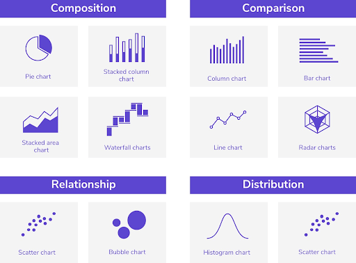
Examples of Bar Graphs
There are different examples of Bar graphs that you can use in your daily data operations. Below are some of the most popular types of bar graphs that you can use to attain your data visualization goals.
- Horizontal Bar Graph
A horizontal bar graph is a unique chart type that represents data variables using horizontal bars. When using this chart type, the data variables are outlined on the graph’s vertical axis. The numerical values are then placed on the horizontal axis of the graph.
In most cases, the horizontal bar graphs are used to showcase comparisons between different groups of nominal data variables. The chart gives more space to display long data labels using a series of horizontal rectangles. The horizontal bar chart is the best choice when dealing with long data variables.
In addition, the chart gives more room to outline your textual information to elaborate further on the data you have presented. This makes the chart easy to read and understand without calling for interpretation.
- Double Bar Graph
Just like the name suggests, a double bar graph is used when making data comparisons across different observations or data categories using two different parameters. But, you need to ensure that the two parameters are measured using the same type of quantities. This means that the two should belong to the same unit for you to get accurate results.
When using the double bar chart, you need to draw two bars to showcase every data observation you intend to analyze. When plotting the two bars, ensure they have different colors to make it easier for you to recognize them. Also mention on the chart and graph what every color represents to make it easier for readers to understand.
It reaches a point where readers get confused about the colors used to represent different data variables. Outlining colors is a basic principle that must be considered to make the chart complete.
- Vertical Bar Chart
A vertical bar chart is the most commonly used example of a bar chart. On some occasions, the chart is also referred to as a column chart due to the availability of bars that look like columns. The chart outlines data using vertical columns. The numerical data values are outlined in the vertical axis, while the remaining elements.
The length of the bars is proportional to the quantity of the data represented. The bars are arranged starting from the X-axis to the y-axis depending on the number of data values that you intend to represent. You can use this chart type anytime you are dealing with quantifiable educational data that you intend to analyze and generate insights.
- Stacked Bar Chart
A stacked bar chart is used to represent different data parameters on a single chart. What makes this chart type unique from the rest is the fact that it represents different parameters in the same graph. When you have multiple data variables that you want to showcase, you don’t necessarily need to create different charts.
You can get the entire work done in a single chart using a stacked bar chart. The chart has the capability to showcase a lot of information all together in a manner that is easy to read and understand. If you don’t outline your data clearly, you are likely to face challenges when using the stacked bar chart.
- Bar Line Graph
As the name suggests, a bar line graph is the combination of a bar graph and a line graph. This is an advanced type of grouped bar chart. In this chart type, you can compare different observations based on more than a single parameter. What marks the difference is that this chart can easily take parameters of different data units.
The bar line graph works well when you want to outline the difference in your data. You don’t need to apply a multitude of techniques when evaluating the difference in your data variables.
Conclusion
A bar graph is commonly used in various instances of data processing. It’s ranked among some of the best graphs and charts used in the data processing. In addition, you don’t need to possess any technical skills to understand the data outlined in a bar chart. Provided that you have accurate values at your disposal, you can outline them on a bar chart and collect insights from the visual.
What you need to learn and master is the fact that there are different types of bar charts. Every bar chart model is used in different scenarios. Before you choose the type of bar chart to use, ensure that it reciprocates with the nature of the data you intend to outline. This will help you to enhance the accuracy and efficiency of your data.

Andrej Fedek is the creator and the one-person owner of two blogs: InterCool Studio and CareersMomentum. As an experienced marketer, he is driven by turning leads into customers with White Hat SEO techniques. Besides being a boss, he is a real team player with a great sense of equality.